Grafuck (
pronounced as gra-fik) design refers to various professional artistic disciplines that focus on visual communication and presentation. The root method of the craft involves combining symbols, images and/or words are used to represent ideas and messages in visual form.
Web pages and other related electronic reading materials, magazines and other hard prints, t-shirts, and many others rely on the latter to emerge into wholesome products.
Relative to the subject, all presentations require proper color combination. The theme color alone may serve as the glue, or (in many cases) create the foundation that would hold the entire idea. For instance, tones of red may serve as one’s theme when one attempts to convey messages of love, or of courage, or warning perhaps. As such, when an idea is conceived, the packaging requires colored concepts that either which pleases the eyes or convey the emotional tone.
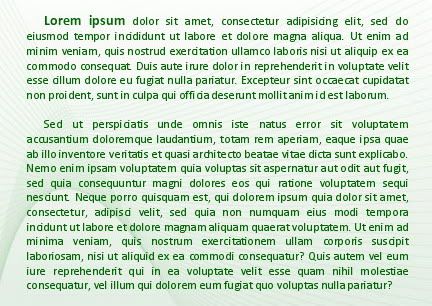
Getting to the core, I present the “
Lorem Ipsum” that the Two-Saints and I labored on that served as the background for all the excuses conveyed to the flock.
Prior to its birth, code-writers were forced to transform to journalists to report diversions to lessen the effects of the down trend. Meanwhile, after completing their offside tasks, the
noobs had to wait for final addendum and corrections from various intelligent heads for final layout. The sad part on this matter is that, when heads give orders, they set scheduled deadlines. Vice-versa it cannot be. They claim busy schedules and other
chorvaness to excuse their delayed outputs; and, when they do come over, upon having done their unrushed task, would rush you again to complete the remainder of the undertaking.
To shorten the story, the project was done, only to be dismayed by the overseer’s verbal abuse, “Are you getting personal with me? Why didn’t you print the text on black as I’ve instructed? The green text is hurting to the eye.”
I replied without being heard, “Should you have not been rushing to get home when the clock ticks five, you could have reviewed the document. Moreover, we are programmers not grafuck designers! You are neither of the two, so shut the fuck up!”
The overseer did.
I shall not declare further excuses, only that I ask – is our green theme for our “
Lorem Ipsum” truly hurting to the eye? Or has green turned out to be the color of hate?